https://colab.research.google.com/If you see a blue "Sign In" button at the top right, click it and log into a Google account.
From the menu, click File, "New notebook".
Execute this command:
!pip install numpy scipy
!pip install scikit-learn
import numpy as np
import matplotlib.pyplot as plt
from sklearn.datasets import make_blobs
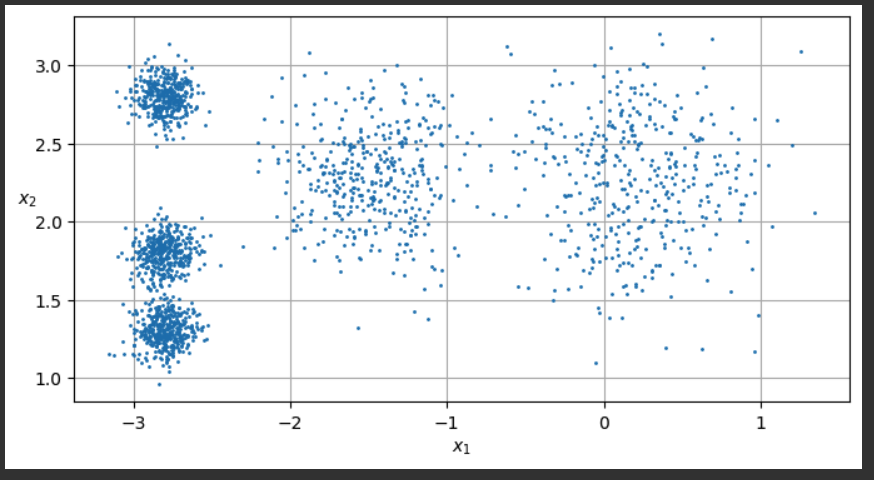
# extra code – the exact arguments of make_blobs() are not important
blob_centers = np.array([[ 0.2, 2.3], [-1.5 , 2.3], [-2.8, 1.8],
[-2.8, 2.8], [-2.8, 1.3]])
blob_std = np.array([0.4, 0.3, 0.1, 0.1, 0.1])
X, y = make_blobs(n_samples=2000, centers=blob_centers, cluster_std=blob_std,
random_state=7)
def plot_clusters(X, y=None):
plt.scatter(X[:, 0], X[:, 1], c=y, s=1)
plt.xlabel("$x_1$")
plt.ylabel("$x_2$", rotation=0)
plt.figure(figsize=(8, 4))
plot_clusters(X)
plt.gca().set_axisbelow(True)
plt.grid()
plt.show()
from sklearn.cluster import KMeans
k = 5
kmeans = KMeans(n_clusters=k, random_state=4, n_init=10)
y_pred = kmeans.fit_predict(X)
def plot_data(X):
plt.plot(X[:, 0], X[:, 1], 'k.', markersize=2)
def plot_centroids(centroids, weights=None, circle_color='w', cross_color='k'):
if weights is not None:
centroids = centroids[weights > weights.max() / 10]
plt.scatter(centroids[:, 0], centroids[:, 1],
marker='o', s=35, linewidths=8,
color=circle_color, zorder=10, alpha=0.9)
plt.scatter(centroids[:, 0], centroids[:, 1],
marker='x', s=2, linewidths=12,
color=cross_color, zorder=11, alpha=1)
def plot_decision_boundaries(clusterer, X, resolution=1000, show_centroids=True,
show_xlabels=True, show_ylabels=True):
mins = X.min(axis=0) - 0.1
maxs = X.max(axis=0) + 0.1
xx, yy = np.meshgrid(np.linspace(mins[0], maxs[0], resolution),
np.linspace(mins[1], maxs[1], resolution))
Z = clusterer.predict(np.c_[xx.ravel(), yy.ravel()])
Z = Z.reshape(xx.shape)
plt.contourf(Z, extent=(mins[0], maxs[0], mins[1], maxs[1]),
cmap="Pastel2")
plt.contour(Z, extent=(mins[0], maxs[0], mins[1], maxs[1]),
linewidths=1, colors='k')
plot_data(X)
if show_centroids:
plot_centroids(clusterer.cluster_centers_)
if show_xlabels:
plt.xlabel("$x_1$")
else:
plt.tick_params(labelbottom=False)
if show_ylabels:
plt.ylabel("$x_2$", rotation=0)
else:
plt.tick_params(labelleft=False)
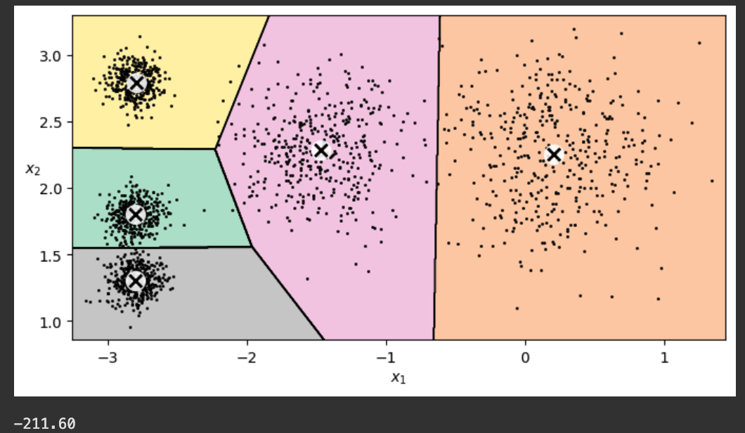
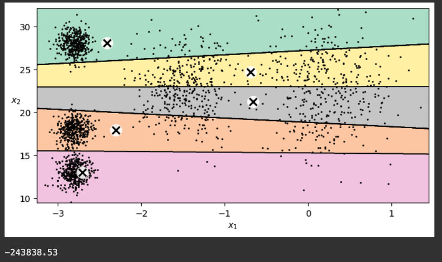
plt.figure(figsize=(8, 4))
plot_decision_boundaries(kmeans, X)
plt.show()
print()
print("{:.2f}".format(kmeans.score(X)))
The score (-211.60) is printed below the chart. This score is the inertia--the negated sum of the squared distance from the centroids to the data. The model's goal is to maximize this number (making it closer to zero).
random_seed = 11

kmeans_iter1 = KMeans(n_clusters=5, init="random", n_init=1, max_iter=1,
                      random_state=random_seed)
kmeans_iter2 = KMeans(n_clusters=5, init="random", n_init=1, max_iter=2,
                      random_state=random_seed)
kmeans_iter3 = KMeans(n_clusters=5, init="random", n_init=1, max_iter=3,
                      random_state=random_seed)
kmeans_iter1.fit(X)
kmeans_iter2.fit(X)
kmeans_iter3.fit(X)

plt.figure(figsize=(10, 8))

plt.subplot(321)
plot_data(X)
plot_centroids(kmeans_iter1.cluster_centers_, circle_color='r', cross_color='w')
plt.ylabel("$x_2$", rotation=0)
plt.tick_params(labelbottom=False)
plt.title("Update the centroids (initially randomly)")

plt.subplot(322)
plot_decision_boundaries(kmeans_iter1, X, show_xlabels=False,
                         show_ylabels=False)
plt.title("Label the instances")

plt.subplot(323)
plot_decision_boundaries(kmeans_iter1, X, show_centroids=False,
                         show_xlabels=False)
plot_centroids(kmeans_iter2.cluster_centers_)

plt.subplot(324)
plot_decision_boundaries(kmeans_iter2, X, show_xlabels=False,
                         show_ylabels=False)

plt.subplot(325)
plot_decision_boundaries(kmeans_iter2, X, show_centroids=False)
plot_centroids(kmeans_iter3.cluster_centers_)

plt.subplot(326)
plot_decision_boundaries(kmeans_iter3, X, show_ylabels=False)

plt.show()

print()
print("{:.2f}".format(kmeans_iter1.score(X)))
print("{:.2f}".format(kmeans_iter2.score(X)))
print("{:.2f}".format(kmeans_iter3.score(X)))
Notice the scores at the bottom: it gets up to -211.6, as good as the ten-iteration model we calculated previously.
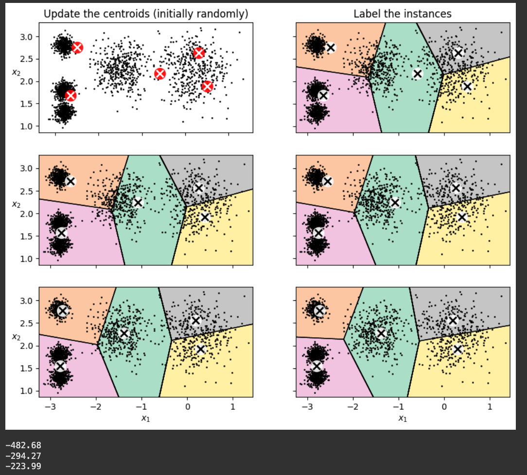
As shown below, the model converges to a bad fit, grouping two clusters together and splitting the rightmost cluster in two.
The score is -223.99, worse than the previous models.
This is why the first model we made used n_init=10, so it would try ten different random starting centroid sets.
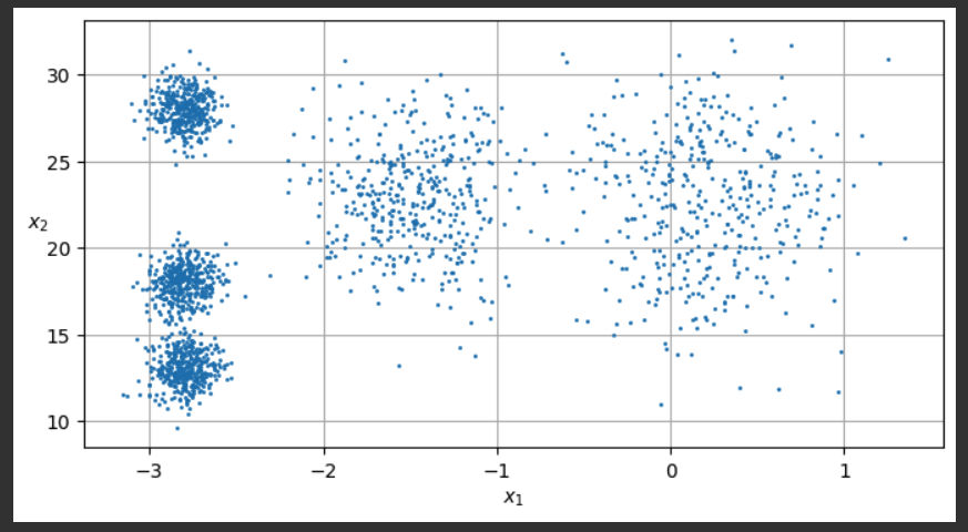
X_exp = X.copy()
for i in range( len(y) ):
  X_exp[i, 1] = 10.0 * X[i, 1]

def plot_clusters(X, y=None):
    plt.scatter(X[:, 0], X[:, 1], c=y, s=1)
    plt.xlabel("$x_1$")
    plt.ylabel("$x_2$", rotation=0)

plt.figure(figsize=(8, 4))
plot_clusters(X_exp)
plt.gca().set_axisbelow(True)
plt.grid()
plt.show()
from sklearn.cluster import KMeans

k = 5
kmeans = KMeans(n_clusters=k, random_state=42, n_init=10)
y_pred = kmeans.fit_predict(X_exp)

def plot_data(X):
    plt.plot(X[:, 0], X[:, 1], 'k.', markersize=2)

def plot_centroids(centroids, weights=None, circle_color='w', cross_color='k'):
    if weights is not None:
        centroids = centroids[weights > weights.max() / 10]
    plt.scatter(centroids[:, 0], centroids[:, 1],
                marker='o', s=35, linewidths=8,
                color=circle_color, zorder=10, alpha=0.9)
    plt.scatter(centroids[:, 0], centroids[:, 1],
                marker='x', s=2, linewidths=12,
                color=cross_color, zorder=11, alpha=1)

def plot_decision_boundaries(clusterer, X, resolution=1000, show_centroids=True,
                             show_xlabels=True, show_ylabels=True):
    mins = X.min(axis=0) - 0.1
    maxs = X.max(axis=0) + 0.1
    xx, yy = np.meshgrid(np.linspace(mins[0], maxs[0], resolution),
                         np.linspace(mins[1], maxs[1], resolution))
    Z = clusterer.predict(np.c_[xx.ravel(), yy.ravel()])
    Z = Z.reshape(xx.shape)

    plt.contourf(Z, extent=(mins[0], maxs[0], mins[1], maxs[1]),
                cmap="Pastel2")
    plt.contour(Z, extent=(mins[0], maxs[0], mins[1], maxs[1]),
                linewidths=1, colors='k')
    plot_data(X)
    if show_centroids:
        plot_centroids(clusterer.cluster_centers_)

    if show_xlabels:
        plt.xlabel("$x_1$")
    else:
        plt.tick_params(labelbottom=False)
    if show_ylabels:
        plt.ylabel("$x_2$", rotation=0)
    else:
        plt.tick_params(labelleft=False)

plt.figure(figsize=(8, 4))
plot_decision_boundaries(kmeans, X_exp)
plt.show()

print()
print("{:.2f}".format(kmeans.score(X)))
import matplotlib.pyplot as plt
from sklearn.datasets import make_moons
from sklearn.model_selection import train_test_split
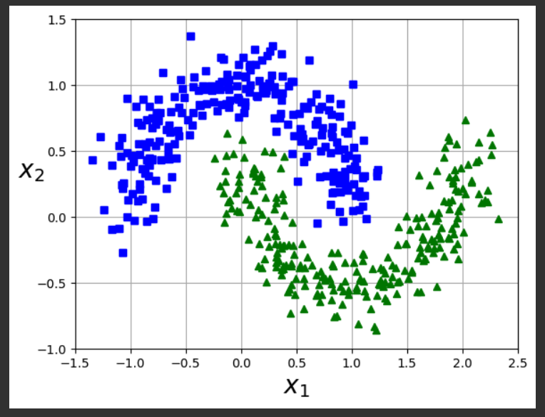
X, y = make_moons(n_samples=500, noise=0.15, random_state=42)
X_train, X_test, y_train, y_test = train_test_split(X, y, random_state=42)
def plot_dataset(X, y, axes):
plt.plot(X[:, 0][y==0], X[:, 1][y==0], "bs")
plt.plot(X[:, 0][y==1], X[:, 1][y==1], "g^")
plt.axis(axes)
plt.grid(True, which='both')
plt.xlabel(r"$x_1$", fontsize=20)
plt.ylabel(r"$x_2$", fontsize=20, rotation=0)
plot_dataset(X, y, [-1.5, 2.5, -1, 1.5])
plt.show()
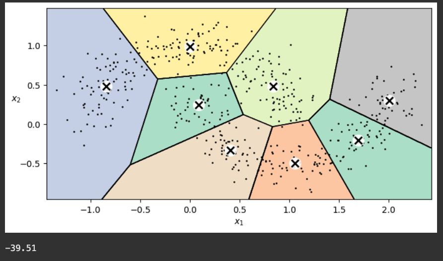
Flag ML 116.1: Fitting the Moons (15 pts)
Use the moon-shaped dataset you just created.Start with the second block of code near the top of this project, titled "Fitting a k-Means Model".
Fit a k-Means model to the data with these parameters:
Make sure you are using the original data (X), not the data with the expanded vertical scale (X_exp). You need to change that in two places.
- k = 8
- random_state=1
- n_init=5
- max_iter=4
(add this parameter inside the KMeans() call)You should see a fit, as shown below.
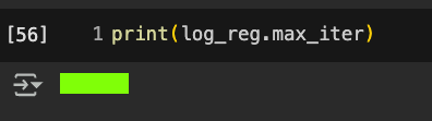
Add a new code block and execute this command:The flag is covered by a green rectangle in the image below.
from sklearn.datasets import load_digits
import matplotlib.pyplot as plt
X_digits, y_digits = load_digits(return_X_y=True)
X_train, y_train = X_digits[:1400], y_digits[:1400]
X_test, y_test = X_digits[1400:], y_digits[1400:]
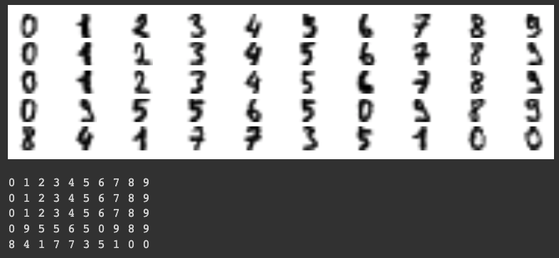
plt.figure(figsize=(8, 2))
for row in range(5):
line = ""
for column in range(10):
plt.subplot(5, 10, 10*row + column + 1)
plt.imshow(X_train[10*row + column].reshape(8, 8), cmap="binary",
interpolation="bilinear")
plt.axis('off')
plt.show()
print()
for row in range(5):
line = ""
for column in range(10):
line += str(y_train[10*row + column]) + " "
print(line)
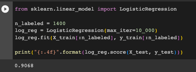
from sklearn.linear_model import LogisticRegression

n_labeled = 1400
log_reg = LogisticRegression(max_iter=10_000)
log_reg.fit(X_train[:n_labeled], y_train[:n_labeled])

print("{:.4f}".format(log_reg.score(X_test, y_test)))
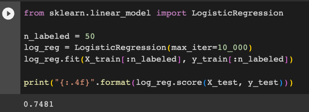
Execute these commands fit a Logistic Regression model to just the first 50 images, with labels.
from sklearn.linear_model import LogisticRegression

n_labeled = 50
log_reg = LogisticRegression(max_iter=10_000)
log_reg.fit(X_train[:n_labeled], y_train[:n_labeled])

print("{:.4f}".format(log_reg.score(X_test, y_test)))
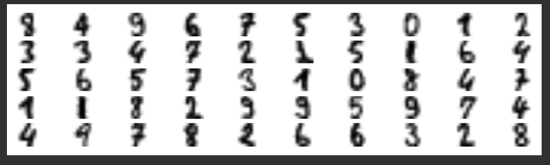
Execute these commands to group the images into 50 clusters using a k-Means model.
We find the "representative" images closest to the centroids and display them.
from sklearn.cluster import KMeans

k = 50
kmeans = KMeans(n_clusters=k, random_state=42, n_init=10)
X_digits_dist = kmeans.fit_transform(X_train)
representative_digit_idx = X_digits_dist.argmin(axis=0)
X_representative_digits = X_train[representative_digit_idx]

plt.figure(figsize=(8, 2))
for index, X_representative_digit in enumerate(X_representative_digits):
    plt.subplot(k // 10, 10, index + 1)
    plt.imshow(X_representative_digit.reshape(8, 8), cmap="binary",
               interpolation="bilinear")
    plt.axis('off')

plt.show()
Execute the code below to insert the manually determined labels and train a Logistic Regression model on just them.
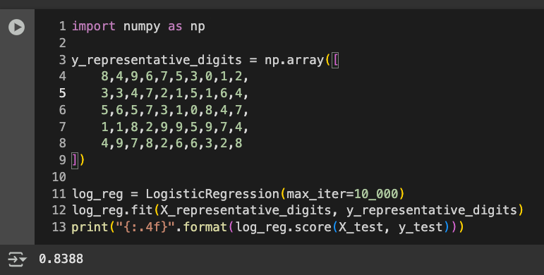
import numpy as np

y_representative_digits = np.array([
    8,4,9,6,7,5,3,0,1,2,
    3,3,4,7,2,1,5,1,6,4,
    5,6,5,7,3,1,0,8,4,7,
    1,1,8,2,9,9,5,9,7,4,
    4,9,7,8,2,6,6,3,2,8
])

log_reg = LogisticRegression(max_iter=10_000)
log_reg.fit(X_representative_digits, y_representative_digits)
print("{:.4f}".format(log_reg.score(X_test, y_test)))
It's far better to learn from 50 selected representative images than from simply the first 50 images.
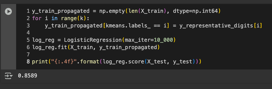
Execute the code below to propagate the labels and train the model on the newly labelled 1400 images:
y_train_propagated = np.empty(len(X_train), dtype=np.int64)
for i in range(k):
    y_train_propagated[kmeans.labels_ == i] = y_representative_digits[i]

log_reg = LogisticRegression(max_iter=10_000)
log_reg.fit(X_train, y_train_propagated)

print("{:.4f}".format(log_reg.score(X_test, y_test)))
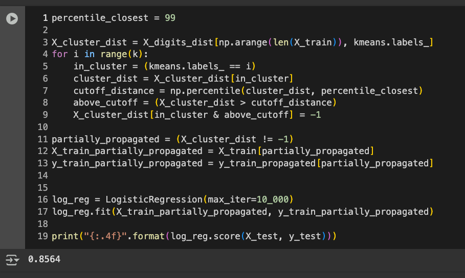
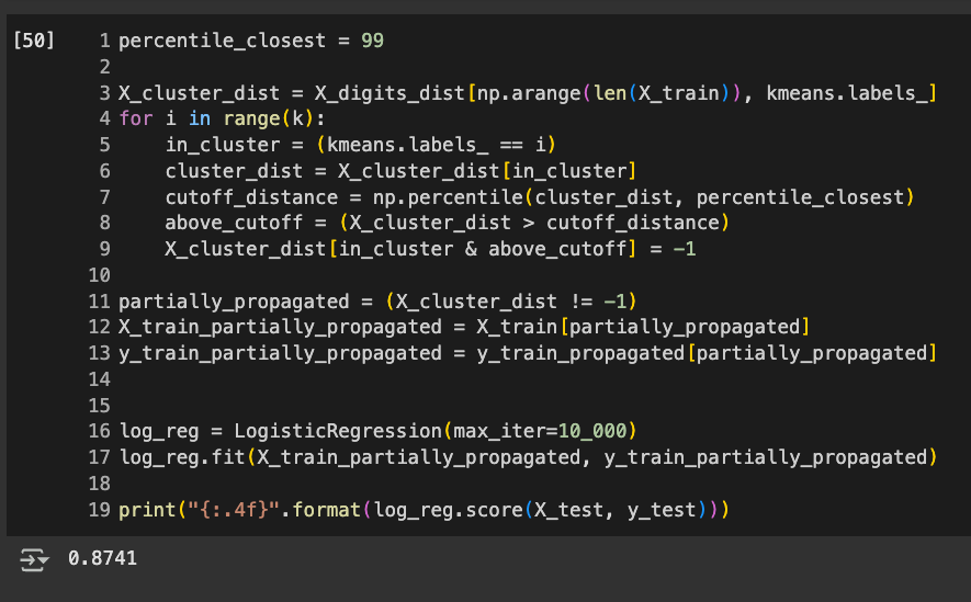
Execute this code:
percentile_closest = 99

X_cluster_dist = X_digits_dist[np.arange(len(X_train)), kmeans.labels_]
for i in range(k):
    in_cluster = (kmeans.labels_ == i)
    cluster_dist = X_cluster_dist[in_cluster]
    cutoff_distance = np.percentile(cluster_dist, percentile_closest)
    above_cutoff = (X_cluster_dist > cutoff_distance)
    X_cluster_dist[in_cluster & above_cutoff] = -1

partially_propagated = (X_cluster_dist != -1)
X_train_partially_propagated = X_train[partially_propagated]
y_train_partially_propagated = y_train_propagated[partially_propagated]


log_reg = LogisticRegression(max_iter=10_000)
log_reg.fit(X_train_partially_propagated, y_train_partially_propagated)

print("{:.4f}".format(log_reg.score(X_test, y_test)))
Flag ML 116.2: 20 Clusters (15 pts)
Repeat the whole thing with only 20 clusters, as summarized below:The fit I got on 5-6-25 is shown below.
- Preparing the Digits Dataset: exactly as above
- Fitting a Model to the Training Set: exactly as above
- Fitting a Model to 50 Instances: change n_labeled to 20
- Using a k-Means Model to form 50 Clusters: change to 20 clusters
- Labelling the 50 Representative Images and Training From Them: add 20 labels you determine manually. DO NOT USE THE LABELS SHOWN ABOVE! The accuracy is 80.86%
- Propagating Labels to All Instances: exactly as above. The accuracy increases.
- Removing Outliers: exactly as above.
Add a new code block and execute this command:The flag is covered by a green rectangle in the image below.
Posted 10-6-23
Image fixed 10-15-23
Flag 1 instructions augmented, video added 10-21-23
Hint added to flag 1 and minor text changes 12-12-23
Flag 2, step 3, changed in a minor way 7-24-24
Scikit-learn version installation added 8-12-24
Updated to current library versions 5-6-25