https://colab.research.google.com/If you see a blue "Sign In" button at the top right, click it and log into a Google account.
From the menu, click File, "New notebook".
import sklearn
from sklearn.datasets import load_iris

iris = load_iris(as_frame=True)
X_iris = iris.data[["petal length (cm)", "petal width (cm)"]].values
y_iris = iris.target

for i in range(5):
  print(X_iris[i], y_iris[i])
print()
print(y_iris.value_counts())
import matplotlib.pyplot as plt
from sklearn.tree import DecisionTreeClassifier
tree_clf = DecisionTreeClassifier(max_depth=2, random_state=42)
tree_clf.fit(X_iris, y_iris)
from pathlib import Path
IMAGES_PATH = Path() / "images" / "decision_trees"
IMAGES_PATH.mkdir(parents=True, exist_ok=True)
from sklearn.tree import export_graphviz
export_graphviz(
tree_clf,
out_file=str(IMAGES_PATH / "iris_tree.dot"), # path differs in the book
feature_names=["petal length (cm)", "petal width (cm)"],
class_names=iris.target_names,
rounded=True,
filled=True
)
from graphviz import Source
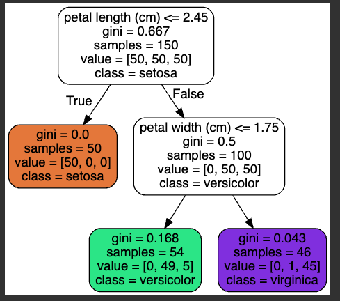
Source.from_file(IMAGES_PATH / "iris_tree.dot")
Notice that the "gini" impurity decreases with each decision.
import numpy as np
import matplotlib.pyplot as plt
from matplotlib.colors import ListedColormap
custom_cmap = ListedColormap(['Red', 'Green', 'DarkMagenta'])
plt.figure(figsize=(8, 4))
lengths, widths = np.meshgrid(np.linspace(0, 7.2, 100), np.linspace(0, 3, 100))
X_iris_all = np.c_[lengths.ravel(), widths.ravel()]
y_pred = tree_clf.predict(X_iris_all).reshape(lengths.shape)
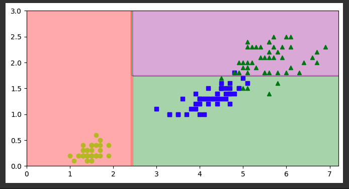
plt.contourf(lengths, widths, y_pred, alpha=0.3, cmap=custom_cmap)
for idx, (name, style) in enumerate(zip(iris.target_names, ("yo", "bs", "g^"))):
plt.plot(X_iris[:, 0][y_iris == idx], X_iris[:, 1][y_iris == idx],
style, label=f"Iris {name}")
plt.show()
Flag ML 113.1: Depth 3 (5 pts)
Repeat the process above, but change max_depth in the second block of code from 2 to 3.The flag is the "gini" impurity of one of the leaf nodes, covered by a green rectangle in the image below.
import numpy as np
import matplotlib.pyplot as plt
import math
np.random.seed(42)
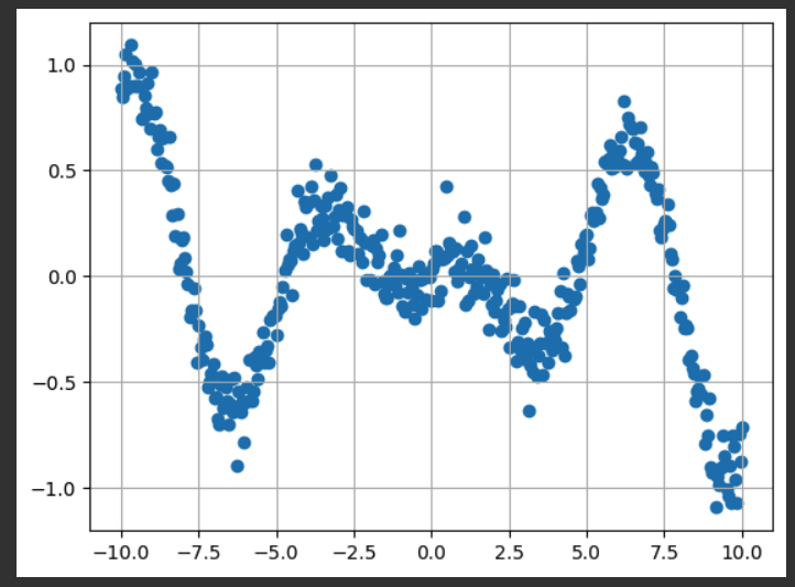
x_data = np.linspace(-10, 10, num=400)
y_data = 0.1*x_data*np.cos(x_data) + 0.1*np.random.normal(size=400)
plt.scatter(x_data[::1], y_data[::1])
plt.grid()
plt.show()
from sklearn.tree import DecisionTreeRegressor
tree_reg = DecisionTreeRegressor(max_depth=2, random_state=42)
tree_reg.fit(x_data.reshape(-1,1), y_data)
from pathlib import Path
IMAGES_PATH = Path() / "images" / "decision_trees"
IMAGES_PATH.mkdir(parents=True, exist_ok=True)
from sklearn.tree import export_graphviz
export_graphviz(
tree_reg,
out_file=str(IMAGES_PATH / "curve_tree.dot"), # path differs in the book
rounded=True,
filled=True
)
from graphviz import Source
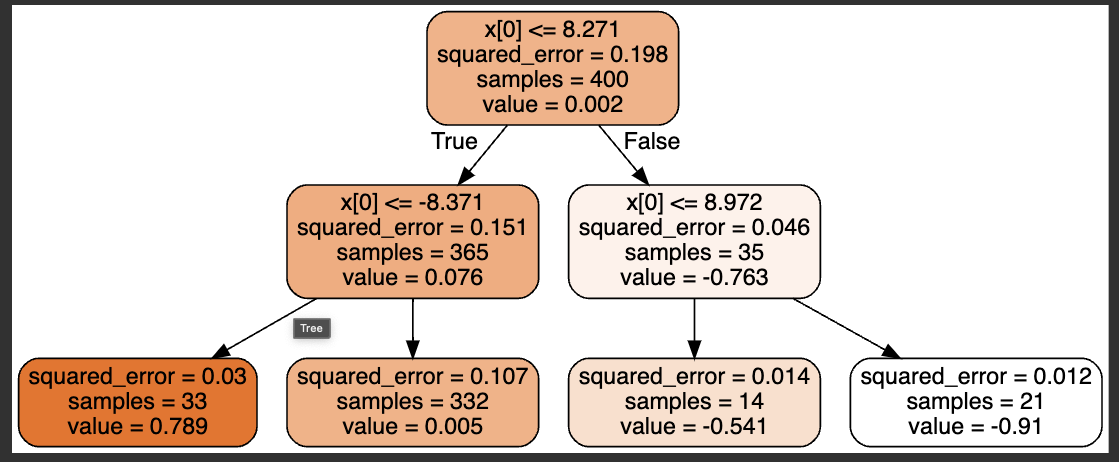
Source.from_file(IMAGES_PATH / "curve_tree.dot")
Notice that the "squared_error" decreases with each decision.
pred_left = 0 		# Just for the flag

def plot_regression_predictions(tree_reg, X, y, axes=[-10, 10, -1.5, 1.5]):
    x1 = np.linspace(axes[0], axes[1], 500).reshape(-1, 1)
    y_pred = tree_reg.predict(x1)
    plt.axis(axes)
    plt.xlabel("$x_1$")
    plt.plot(X, y, "b.")
    plt.plot(x1, y_pred, "r.-", linewidth=2, label=r"$\hat{y}$")

    global pred_left
    pred_left = y_pred[0]

plot_regression_predictions(tree_reg, x_data, y_data)

print(f"{pred_left:0.5f}")
print()

plt.show()
The number at the top is the Y value of the prediction for the leftmost point.
Flag ML 113.2: Depth 6 (5 pts)
Repeat the process above, but change max_depth in the second block of code from 2 to 6.The flag is covered by a green rectangle in the image below.
Flag ML 113.3: Unlimited Depth (5 pts)
Repeat the process above, but remove max_depth in the second block of code.The model severelyy overfits the data.
The flag is covered by a green rectangle in the image below.
Posted 9-20-23
Typo fixed 9-30-23
Video added 10-21-23
Random seed added 12-12-23
Minor text correction 12-12-23