Jupyter Notebook Server
This project uses the SecML library, which hasn't been updated since 2023. It no longer works in Google Colab. Instead, you need to use a local virtual machine running an older Jupyter Notebook.See project ML 107 to see how to download and run that machine.
We need training and testing sets, as usual. The validation set isn't used in this project, but it will be in the next one.
import secml
random_state = 999
n_features = 2 # Number of features
n_samples = 300 # Number of samples
centers = [[-1, -1], [1, 1]] # Centers of the clusters
cluster_std = 0.9 # Standard deviation of the clusters
from secml.data.loader import CDLRandomBlobs
dataset = CDLRandomBlobs(n_features=n_features,
centers=centers,
cluster_std=cluster_std,
n_samples=n_samples,
random_state=random_state).load()
n_tr = 100 # Number of training set samples
n_val = 100 # Number of validation set samples
n_ts = 100 # Number of test set samples
# Split in training, validation and test
from secml.data.splitter import CTrainTestSplit
splitter = CTrainTestSplit(
train_size=n_tr + n_val, test_size=n_ts, random_state=random_state)
tr_val, ts = splitter.split(dataset)
splitter = CTrainTestSplit(
train_size=n_tr, test_size=n_val, random_state=random_state)
tr, val = splitter.split(dataset)
# Normalize the data
from secml.ml.features import CNormalizerMinMax
nmz = CNormalizerMinMax()
tr.X = nmz.fit_transform(tr.X)
val.X = nmz.transform(val.X)
ts.X = nmz.transform(ts.X)
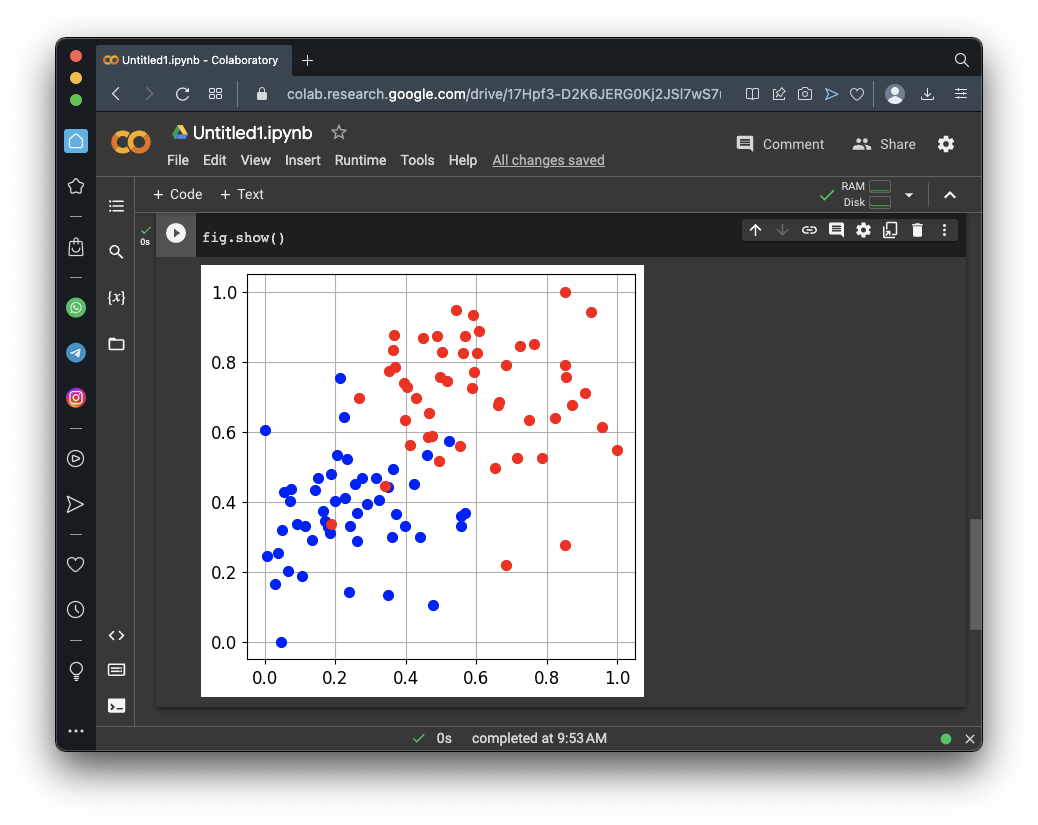
# Display the training set
from secml.figure import CFigure
# Only required for visualization in notebooks
%matplotlib inline
fig = CFigure(width=5, height=5)
# Convenience function for plotting a dataset
fig.sp.plot_ds(tr)
fig.show()
The task of this model is to sort the dots into their categories.
# Metric to use for training and performance evaluation
from secml.ml.peval.metrics import CMetricAccuracy
metric = CMetricAccuracy()

# Creation of the multiclass classifier
from secml.ml.classifiers import CClassifierSVM
from secml.ml.kernels import CKernelRBF
clf = CClassifierSVM(kernel=CKernelRBF(gamma=10), C=1)

# We can now fit the classifier
clf.fit(tr.X, tr.Y)
print("Training of classifier complete!")

# Compute predictions on a test set
y_pred = clf.predict(ts.X)

# Evaluate the accuracy of the classifier
acc = metric.performance_score(y_true=ts.Y, y_pred=y_pred)

print("Accuracy on test set: {:.2%}".format(acc))
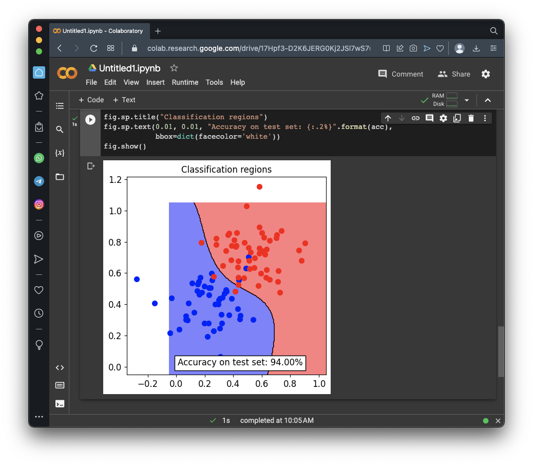
fig = CFigure(width=5, height=5)

# Convenience function for plotting the decision function of a classifier
fig.sp.plot_decision_regions(clf, n_grid_points=200)

fig.sp.plot_ds(ts)
fig.sp.grid(grid_on=False)

fig.sp.title("Classification regions")
fig.sp.text(0.01, 0.01, "Accuracy on test set: {:.2%}".format(acc),
            bbox=dict(facecolor='white'))
fig.show()
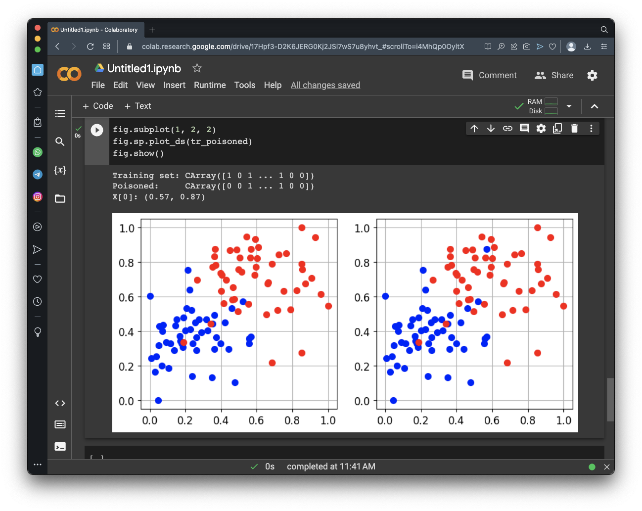
Execute these commands to change the first label:
print("Training set:", tr.Y)
tr_poisoned = tr.deepcopy()
tr_poisoned.Y[0] = 0
print("Poisoned:    ", tr_poisoned.Y)
print('X[0]: ({:.2f}, {:.2f})'.format(tr_poisoned.X.tolist()[0][0],
                              tr_poisoned.X.tolist()[0][1]))
print()
fig = CFigure(width=9, height=4)
fig.subplot(1, 2, 1)
fig.sp.plot_ds(tr)

fig.subplot(1, 2, 2)
fig.sp.plot_ds(tr_poisoned)
fig.show()
As shown below, one red dot in the top center is now blue.
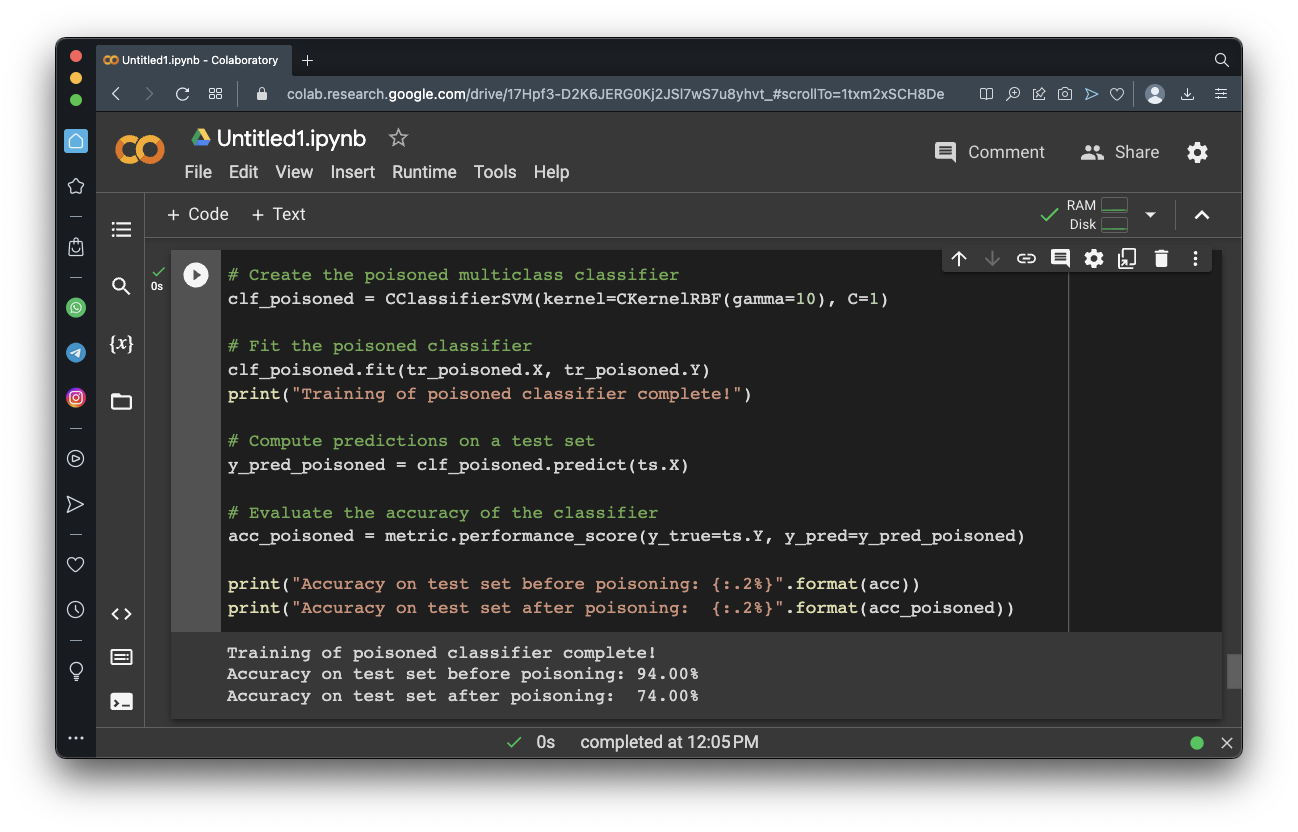
# Create the poisoned multiclass classifier
clf_poisoned = CClassifierSVM(kernel=CKernelRBF(gamma=10), C=1)
# Fit the poisoned classifier
clf_poisoned.fit(tr_poisoned.X, tr_poisoned.Y)
print("Training of poisoned classifier complete!")
# Compute predictions on a test set
y_pred_poisoned = clf_poisoned.predict(ts.X)
# Evaluate the accuracy of the classifier
acc_poisoned = metric.performance_score(y_true=ts.Y, y_pred=y_pred_poisoned)
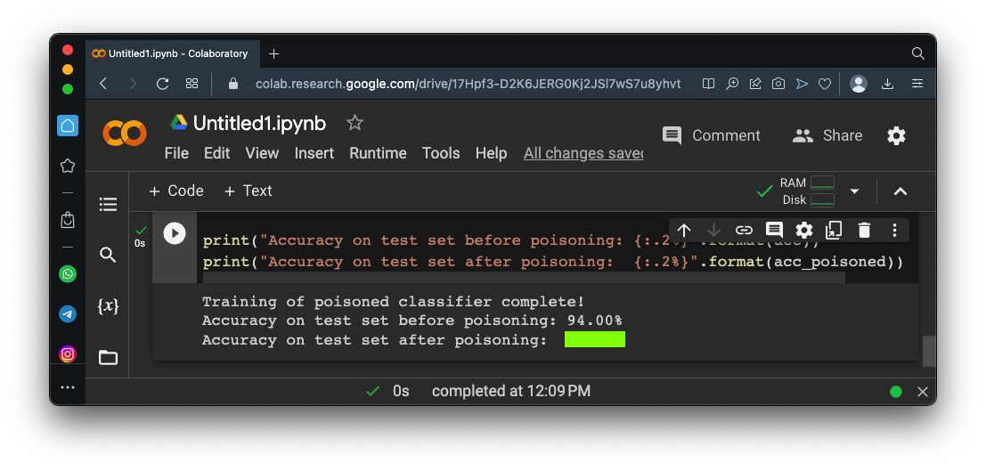
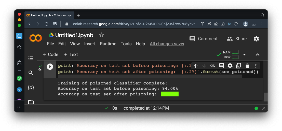
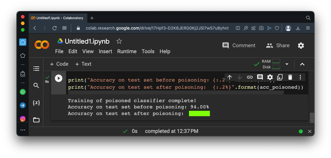
print("Accuracy on test set before poisoning: {:.2%}".format(acc))
print("Accuracy on test set after poisoning: {:.2%}".format(acc_poisoned))
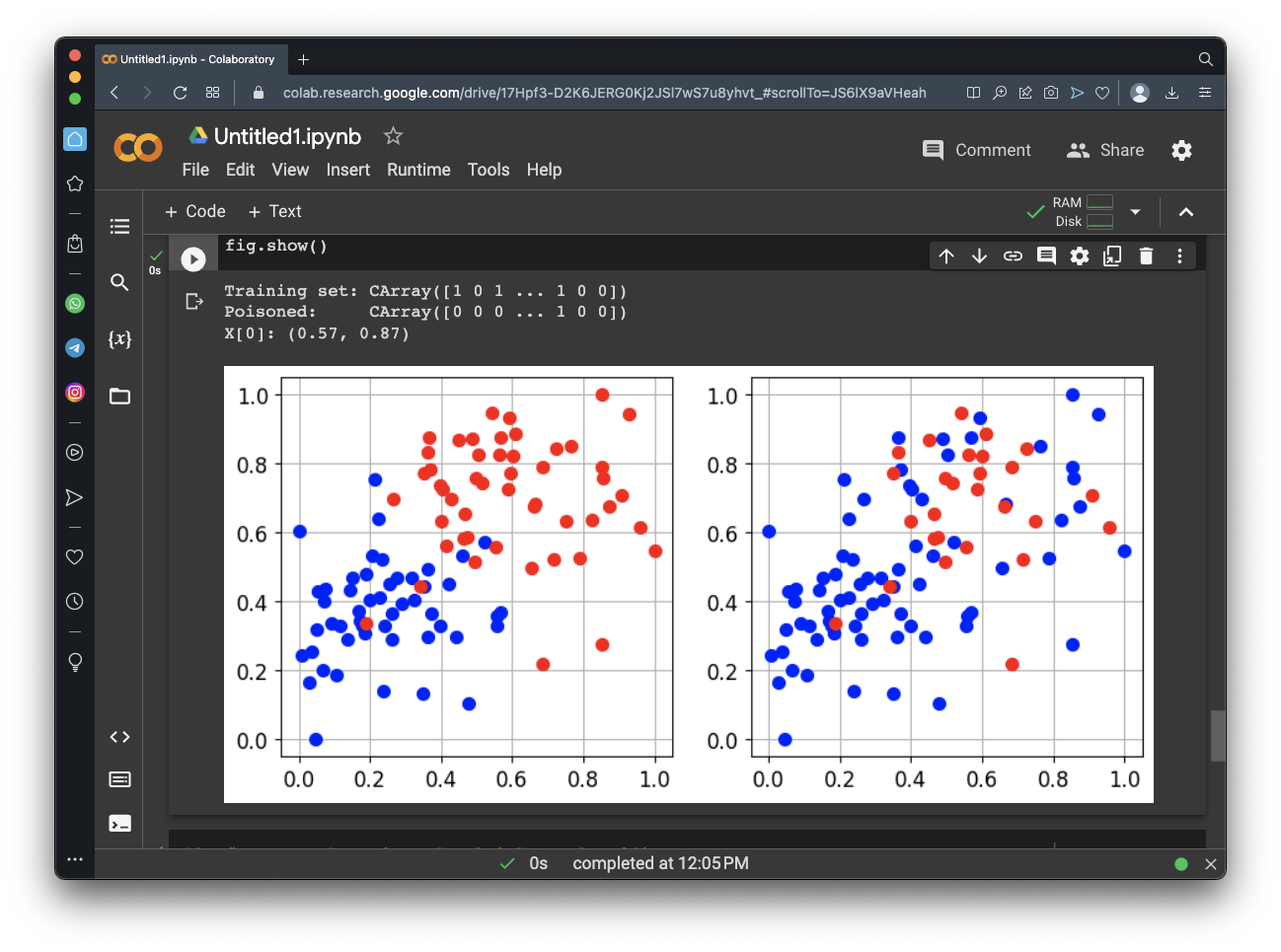
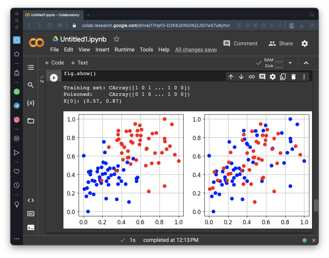
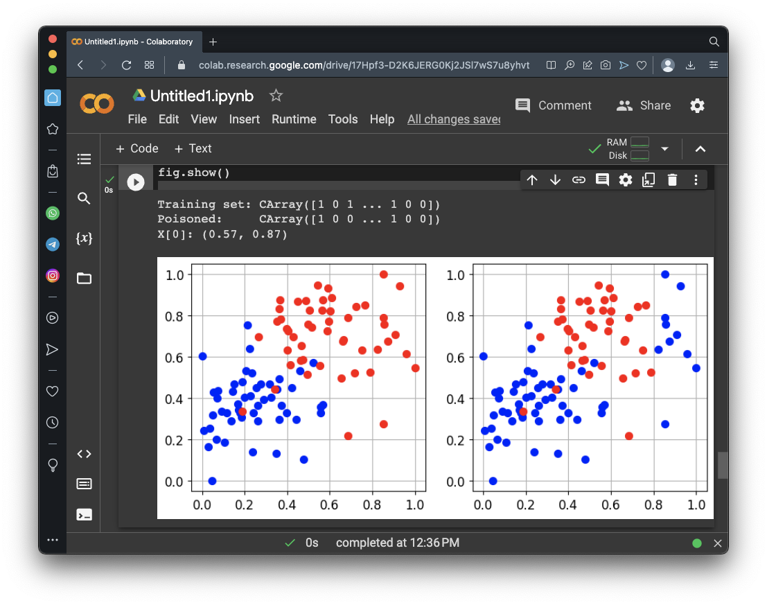
print("Training set:", tr.Y)
tr_poisoned = tr.deepcopy()

for i in range(40):
  if tr_poisoned.Y[i] == 1:
    tr_poisoned.Y[i] = 0

print("Poisoned:    ", tr_poisoned.Y)
print('X[0]: ({:.2f}, {:.2f})'.format(tr_poisoned.X.tolist()[0][0],
                              tr_poisoned.X.tolist()[0][1]))
print()
fig = CFigure(width=9, height=4)
fig.subplot(1, 2, 1)
fig.sp.plot_ds(tr)

fig.subplot(1, 2, 2)
fig.sp.plot_ds(tr_poisoned)
fig.show()
As shown below, many red dots have turned blue.
# Create the poisoned multiclass classifier
clf_poisoned = CClassifierSVM(kernel=CKernelRBF(gamma=10), C=1)

# Fit the poisoned classifier
clf_poisoned.fit(tr_poisoned.X, tr_poisoned.Y)
print("Training of poisoned classifier complete!")

# Compute predictions on a test set
y_pred_poisoned = clf_poisoned.predict(ts.X)

# Evaluate the accuracy of the classifier
acc_poisoned = metric.performance_score(y_true=ts.Y, y_pred=y_pred_poisoned)

print("Accuracy on test set before poisoning: {:.2%}".format(acc))
print("Accuracy on test set after poisoning:  {:.2%}".format(acc_poisoned))
Flag ML 109.1: Poisoning Even More Red Dots (10 pts)
Adjust the attack above to test the first 60 dots in the training set, and turn the red dots blue.The flag is covered by a green rectangle in the image below.
Flag ML 109.2: Reversing Dots (10 pts)
Adjust the attack above to reverse the colors of the first 40 dots in the training set, as shown below.The flag is covered by a green rectangle in the image below.
Flag ML 109.3: Poisoning Rightmost Red Dots (10 pts)
Adjust the attack above to change the red dots with a horizontal coordinate greater than 0.8 blue, as shown below.The flag is covered by a green rectangle in the image below.
Posted 5-4-23
Minor update 10-7-23
"three groups" changed to "two groups" 7-24-24
Jupyter server note added 5-15-25