https://colab.research.google.com/If you see a blue "Sign In" button at the top right, click it and log into a Google account.
From the menu, click File, "New notebook".
!pip install secml
import secml
random_state = 999
n_features = 2 # Number of features
n_samples = 125 # Number of samples
centers = [[-1.1, -2], [1.5, 1.6]] # Centers of the clusters
cluster_std = 0.7 # Standard deviation of the clusters
from secml.data.loader import CDLRandomBlobs
dataset = CDLRandomBlobs(n_features=n_features,
centers=centers,
cluster_std=cluster_std,
n_samples=n_samples,
random_state=random_state).load()
n_tr = 100 # Number of training set samples
n_ts = 25 # Number of test set samples
# Split in training and test
from secml.data.splitter import CTrainTestSplit
splitter = CTrainTestSplit(
train_size=n_tr, test_size=n_ts, random_state=random_state)
tr, ts = splitter.split(dataset)
print()
from secml.figure import CFigure
# Only required for visualization in notebooks
%matplotlib inline
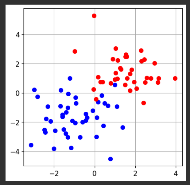
fig = CFigure(width=5, height=5)
# Convenience function for plotting a dataset
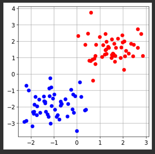
fig.sp.plot_ds(tr)
fig.show()
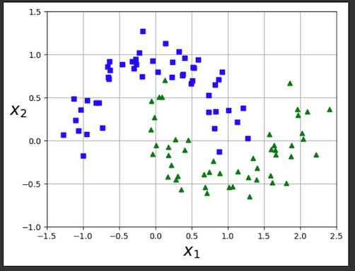
The task of this model is to sort the dots into their categories.
from secml.ml.classifiers import CClassifierSVM
svm = CClassifierSVM()
svm.fit(tr.X, tr.Y)
# Compute predictions on a test set
y_pred = svm.predict(ts.X)
# Metric to use for training and performance evaluation
from secml.ml.peval.metrics import CMetricAccuracy
metric = CMetricAccuracy()
# Evaluate the accuracy of the classifier
acc = metric.performance_score(y_true=ts.Y, y_pred=y_pred)
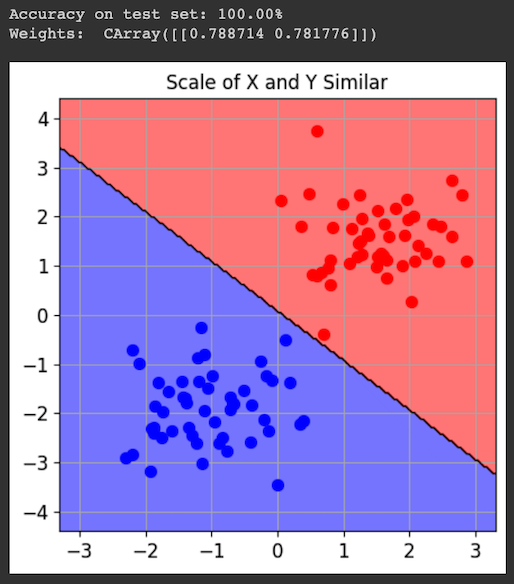
print("Accuracy on test set: {:.2%}".format(acc))
print("Weights: ", svm.w)
print()
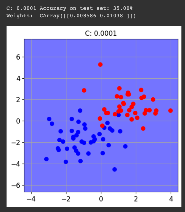
fig = CFigure(width=5, height=5)
# Convenience function for plotting the decision function of a classifier
fig.sp.plot_decision_regions(svm, n_grid_points=200, grid_limits=[(-3,3),(-4,4)])
fig.sp.plot_ds(tr)
fig.sp.grid(grid_on=True)
fig.sp.title("Scale of X and Y Similar")
fig.show()
Also, the weights of the X and Y features are similar, since they are both equally useful at distinguishing the classes.
tr_exp = tr.deepcopy()
for i in range(n_tr):
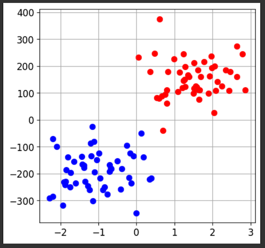
tr_exp.X[i,1] = 100.0 * tr.X[i,1]
ts_exp = ts.deepcopy()
for i in range(n_ts):
ts_exp.X[i,1] = 100.0 * ts.X[i,1]
from secml.figure import CFigure
# Only required for visualization in notebooks
%matplotlib inline
fig = CFigure(width=5, height=5)
# Convenience function for plotting a dataset
fig.sp.plot_ds(tr_exp)
fig.show()
from secml.ml.classifiers import CClassifierSVM
svm = CClassifierSVM()
svm.fit(tr_exp.X, tr_exp.Y)
# Compute predictions on a test set
y_pred = svm.predict(ts_exp.X)
# Metric to use for training and performance evaluation
from secml.ml.peval.metrics import CMetricAccuracy
metric = CMetricAccuracy()
# Evaluate the accuracy of the classifier
acc = metric.performance_score(y_true=ts_exp.Y, y_pred=y_pred)
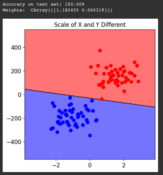
print("Accuracy on test set: {:.2%}".format(acc))
print("Weights: ", svm.w)
print()
fig = CFigure(width=5, height=5)
# Convenience function for plotting the decision function of a classifier
fig.sp.plot_decision_regions(svm, n_grid_points=200, grid_limits=[(-3.5,3.5),(-500,500)])
fig.sp.plot_ds(tr_exp)
fig.sp.grid(grid_on=False)
fig.sp.title("Scale of X and Y Different")
fig.show()
Also, the weights of the X and Y features are very different.
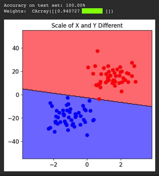
Flag ML 112.1: Different Y Scale (10 pts)
Repeat the process above, but change the Y magnification in the third block of code from 100 to 10.The flag is the weight for the Y feature, covered by a green rectangle in the image below.
!pip install secml
import secml
random_state = 999

n_samples = 100  # Number of samples

n_features = 2  # Number of features

centers = [[-1.1, -2], [1.5, 1.6]]  # Centers of the clusters
cluster_std = 1.2  # Standard deviation of the clusters

from secml.data.loader import CDLRandomBlobs
dataset = CDLRandomBlobs(n_features=n_features,
                         centers=centers,
                         cluster_std=cluster_std,
                         n_samples=n_samples,
                         random_state=random_state).load()

n_tr = 80  # Number of training set samples
n_ts = 20  # Number of test set samples

# Split in training and test
from secml.data.splitter import CTrainTestSplit
splitter = CTrainTestSplit(
    train_size=n_tr, test_size=n_ts, random_state=random_state)
tr, ts = splitter.split(dataset)
print()

from secml.figure import CFigure
# Only required for visualization in notebooks
%matplotlib inline

fig = CFigure(width=5, height=5)

# Convenience function for plotting a dataset
fig.sp.plot_ds(tr)

fig.show()
from secml.ml.classifiers import CClassifierSVM
from secml.ml.peval.metrics import CMetricAccuracy
metric = CMetricAccuracy()
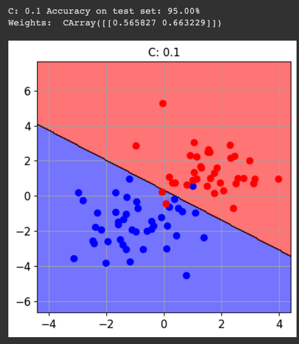
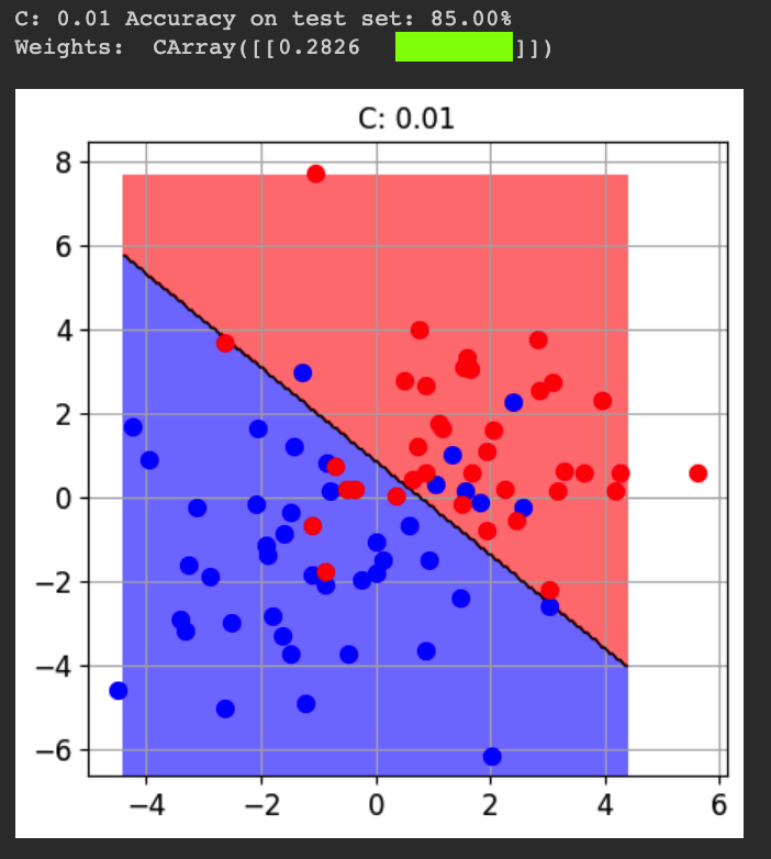
for cc in [0.0001, 0.001, 0.01, 0.1, 1]:
svm = CClassifierSVM(C=cc)
svm.fit(tr.X, tr.Y)
y_pred = svm.predict(ts.X)
acc = metric.performance_score(y_true=ts.Y, y_pred=y_pred)
print()
print("C:", cc, "Accuracy on test set: {:.2%}".format(acc))
print("Weights: ", svm.w)
print()
fig = CFigure(width=5, height=5)
fig.sp.plot_decision_regions(svm, n_grid_points=200, grid_limits=[(-4,4),(-6,7)])
fig.sp.plot_ds(tr)
fig.sp.grid(grid_on=True)
fig.sp.title("C: " + str(cc))
fig.show()
Flag ML 112.2: Larger Standard Deviation (10 pts)
Repeat the process above, but change the standard deviation "cluster_std" from 1.2 to 2.0.The flag is the weight for the Y feature, covered by a green rectangle in the image below.
import matplotlib.pyplot as plt
from sklearn.datasets import make_moons
X, y = make_moons(n_samples=100, noise=0.15, random_state=42)

def plot_dataset(X, y, axes):
    plt.plot(X[:, 0][y==0], X[:, 1][y==0], "bs")
    plt.plot(X[:, 0][y==1], X[:, 1][y==1], "g^")
    plt.axis(axes)
    plt.grid(True, which='both')
    plt.xlabel(r"$x_1$", fontsize=20)
    plt.ylabel(r"$x_2$", fontsize=20, rotation=0)

plot_dataset(X, y, [-1.5, 2.5, -1, 1.5])
plt.show()
import numpy as np
from sklearn.datasets import make_moons
from sklearn.pipeline import Pipeline
from sklearn.preprocessing import PolynomialFeatures, StandardScaler
from sklearn.svm import LinearSVC
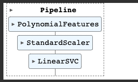
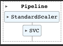
polynomial_svm_clf = Pipeline([
("poly_features", PolynomialFeatures(degree=3)),
("scaler", StandardScaler()),
("svm_clf", LinearSVC(C=10, loss="hinge", random_state=42, max_iter=10000))
])
polynomial_svm_clf.fit(X, y)
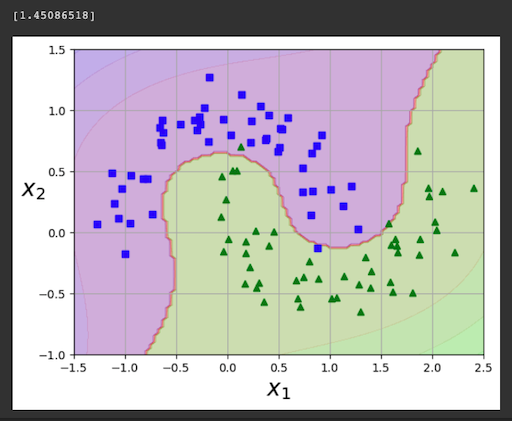
def plot_predictions(clf, axes):
x0s = np.linspace(axes[0], axes[1], 100)
x1s = np.linspace(axes[2], axes[3], 100)
x0, x1 = np.meshgrid(x0s, x1s)
X = np.c_[x0.ravel(), x1.ravel()]
y_pred = clf.predict(X).reshape(x0.shape)
y_decision = clf.decision_function(X).reshape(x0.shape)
plt.contourf(x0, x1, y_pred, cmap=plt.cm.brg, alpha=0.2)
plt.contourf(x0, x1, y_decision, cmap=plt.cm.brg, alpha=0.1)
print()
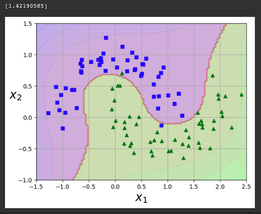
print(polynomial_svm_clf.decision_function([(0,0)]))
print()
plot_predictions(polynomial_svm_clf, [-1.5, 2.5, -1, 1.5])
plot_dataset(X, y, [-1.5, 2.5, -1, 1.5])
plt.show()
Flag ML 112.3: Second Degree (10 pts)
Repeat the process above, but change the degree of the polynomial from 3 to 2.This makes the model much worse.
The flag is the decision function at the origin, covered by a green rectangle in the image below.
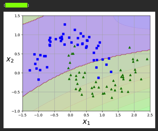
Execute these commands to use the "Kernel Trick" to fit a model which is as good as one with polynomial features added, but much faster to compute.
from sklearn.pipeline import Pipeline
from sklearn.preprocessing import StandardScaler
from sklearn.svm import SVC

poly_kernel_svm_clf = Pipeline([
        ("scaler", StandardScaler()),
        ("svm_clf", SVC(kernel="poly", degree=3, coef0=1, C=5))
    ])
poly_kernel_svm_clf.fit(X, y)
import numpy as np
def plot_predictions(clf, axes):
x0s = np.linspace(axes[0], axes[1], 100)
x1s = np.linspace(axes[2], axes[3], 100)
x0, x1 = np.meshgrid(x0s, x1s)
X = np.c_[x0.ravel(), x1.ravel()]
y_pred = clf.predict(X).reshape(x0.shape)
y_decision = clf.decision_function(X).reshape(x0.shape)
plt.contourf(x0, x1, y_pred, cmap=plt.cm.brg, alpha=0.2)
plt.contourf(x0, x1, y_decision, cmap=plt.cm.brg, alpha=0.1)
print()
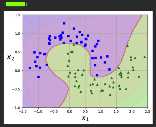
print(poly_kernel_svm_clf.decision_function([(0,0)]))
print()
plot_predictions(poly_kernel_svm_clf, [-1.5, 2.5, -1, 1.5])
plot_dataset(X, y, [-1.5, 2.5, -1, 1.5])
plt.show()
Flag ML 112.4: Tenth Degree (10 pts)
Repeat the process above, but change the degree of the polynomial from 3 to 10. Also change "coef0" from 1 to 100.The flag is the decision function at the origin, covered by a green rectangle in the image below.
Posted 9-17-23
Video added 10-21-23